Don’t just choose a grid. Design it!
a post on Process
07/02/2011 · Newport, Wales · Last Thursday I gave a short talk on grids and Gridset at Port80 localhost in Newport, Wales. The talk introduced some to thoughts that we’ve been batting around the Mark Boulton Design studio for months, so I thought it might help to write up my talk notes here.
Introductions
Hello, I’m Nathan Ford; Creative Director at Mark Boulton Design and creator of Gridset. You may be trying to place my accent… I’m from Texas and moved to Wales about 2 years ago to work with the team at Mark Boulton Design.
It seems everyone knows Mark. I have always respected him for being even more of an über-nerd about type and design than I am. When I started at MBD in May of 2011, every project that was coming in had some responsive aspect. We were continually trying to find ways to make working with responsive layout easier, leading me to build a simple form that spat out fluid grid CSS for set breakpoints. This eventually evolved into Gridset, which launched last August.
When building Gridset into a product, we had two goals:
- Make working with responsive layouts quicker and easier.
- Use technology to extend our abilities and allow for more variation in grid usage.
That first point has been solved by many, in a variety of ways. Just yesterday, Harry Roberts (@csswizardry) proposed a new, clean way of implementing responsive grid systems. You should check it out.
The second point is where we are going to focus this evening.
Grid systems on the web
Discussions of grids on the web usually revolve around two questions: “Why use them?” and “How do I build them?” Here are my answers, as succinct as I can make them so we can move on:
- Why use a grid? Grids lend order and to a design to reinforce hierarchy – and therefore the clarity — of your content. Clarity being seen as the utmost importance of a design.
- How do you build a grid? Any way you can. Sketches, PSDs, CSS. It really does not matter. A grid is really just a plan. What matters is the thought that goes into it.
There is that strange caveat for grids on the web: Grids for print have always divided both the horizontal and vertical space, using line-heights as a guide for vertical divisions. Since we are working on the web with inherently fluid canvasses and ever-diverse content, keeping a baseline rhythm can be damn near impossible, leading most to mainly just focus on left-right division of space and alignment. This is where we will focus as well.
Now that we are past these questions, we need to figure out the right grid for your content.
Design your grid. Don’t just choose one.
Nathan Smith built 960.gs a few years back and it went a long way to popularize the application of grid-based layout on the web. This was a leap forward in bringing grid-based thinking to the web, but 12 columns at 960px wide has become so ubiquitous now that it limits our progress into more considered and complex grid design. 960.gs – and most frameworks – invert a key aspect of grid theory:
You should design a grid based on your content’s constraints, not design your content based on a grid’s constraints.
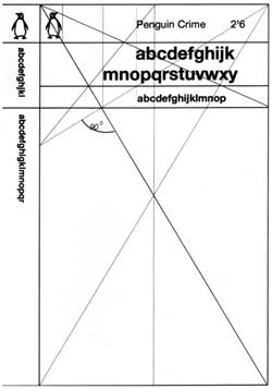
This is not a new idea. Some of the iconic grids we feature on the Gridset site were seriously deliberated over by their original designers. Karl Gerstner famously sought to build the right balance of structure and flexibility into his grid for Capital Magazine’s 1962 redesign. Romek Marber’s grid for the redesign of Penguin’s book covers in the late 60’s shows a sophisticated mastery of the golden ratio.
Even one column of text can be considered a grid. Jan Tschichold, in setting just the text area of a single page of a book divided the page into 9 equal sections horizontally and vertically in order create a rational harmony between the page and the block of text.
Mark Boulton has been talking about building our web designs “content out”. By this he means start with the content you have, then build a grid up from that. For example, if you know your site’s revenue is based on 300px wide advertisements, build your grid, and eventual layout, based on that measurement. Given that web “pages” are inherently fluid, this allows us to build structure for our content in the absence of a set page size.
Balancing Flexibility & Structure
The most flexible grid – giving us the most possibilities for layout – would be a column for every pixel right? How useless would that be? Flexibility is not solely what we seek in a grid system. We want a harmonious and meaningful utilization of space to house our content. This includes proportions between elements, as well as the proportions of negative space. Columns are a crutch. Less columns means less options for layout, reinforcing structure, creating a stronger content hierarchy, and therefore improving the overall clarity of communication.
When building grids, we should also consider what to do with the space on either side of the content. We have all seen the typical max-width: 960px layout that allows both sides browser window to stretch into infinity. What if we use dead columns (or empty columns), changing their proportion to the utilized space for different breakpoints, rather than setting a max-width? This would allow us to create a consistent harmony between the size of negative space and the content.
Building your grid for the web
Let’s take a look at our ingredients for building grids in CSS:
- px - Pixels are not fluid, and relate only to the shifting sand that is screen pixel density. Probably best to ignore them for left-right alignment.
- em - Ems create a correlation between our layout and our type, which is definitely content out, but they have a dirty little secret: the width of an em is determined by the height of the character box, not the character width. This makes them ideal for vertical layout, but cumbersome for left-right alignment.
- % - Percentages allow us to proportionally divide our container, no matter what shape it takes, and give us the best opportunity to create meaningful horizontal proportions between elements. When using Gridset, you will see a heavy preference for percentages.
You may have seen viewport width (vw) and viewport height (vh) units. These are not fully supported yet, and tie us, inherently, to our browser size, not an element’s container. This is not content out and may lead to a closet full of testing devices (which we, indeed, have at Mark Boulton Design).
Using these ingredients, how do we concoct a system of content-out, responsive grids that give our content balance and structure within a fluid canvas? Harry Roberts defined this well in his post on Responsive Grid Systems. I have borrowed from him and edited a bit here because I agree with a lot of his thinking, but hold my own opinions as well.
A responsive grid system must:
- Have different traits at different sizes - because while our content does not change, our available space does.
- Be fluid between breakpoints - because we need to cover all bases.
- Have enough control to decide which elements will transform at which point.
Gridset makes it easy
We called our app “Gridset” because that is exactly what you create: a set of grids for varying breakpoints. When you create a new Gridset, you can start with a template based on historic grid designs – such as The Gerstner or The Marber, or you can roll your own.
Name your first grid, then set its width to the minimum pixel size at which you want it to apply. If you want this grid to be used on screens that are a common “desktop” size, you could could set this to 960px. You can set it for any size, but we also give you some common widths as a shortcut.
Next, decide how many columns you need. At this point, we have set a limit of 18 columns on this field, because as we said earlier: too many columns can be a crutch. Once your columns are laid in, you can adjust the gutter width, or apply ratios across the widths. You can also drag each column to rearrange the order, and you can resize each individual column width.
Repeat this process for each breakpoint that requires a different layout. Create multiple grids at the same width to produce a “compound grid”. Gridset will output the PNGs for your design apps, and generate CSS classes namespaced for each of your grids. This allows you to change the layout of element’s in your page for different screens sizes using what Harry Roberts calls “silent classes”.
I went on to demo more of Gridset’s features, but I will spare you the details. Read more about how to use Gridset here.
The 12 Orthogons of Wersin
While reading Kimberly Elam’s Geometry of Design, I came across the concept of “dynamic rectangles”. Further investigation yielded the work of Wolfgang von Wersin, a Czech-born designer- painter-architect. In 1956 he wrote a book entitled (bear with me) “The Book of Rectangles, Spatial Law and Gestures of The Orthogons Described” in which he defined twelve dynamic rectangles – which he called “orthogons” – that have been “used historically by artists, architects and calligraphers to guide the placement and interaction of elements in a design.”
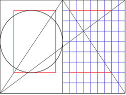
Under the “Ratio” option on each grid you create in Gridset, you can find the ratios that describe each of these 12 rectangles, and apply them to your columns. Will this give your layout some immediate benefit? I honestly don’t know. Depending on how you use them, each may yield interesting new layouts, like when Marber applied the golden ratio (called auron by Wersin) to his grid. To me, these dynamic rectangles are more than dusty mathematic abstracts; within Gridset they become possibilities we have yet to explore.
Grids are the foundation of layout, therefore grids are the beginning of clear communication. Given this importance, I hope that you will give Gridset a try, and I hope that it helps you build more thoughtful grid systems for your next project.
A massive “Thank you!” to Port 80 for having me out.