The Form of the Book, Digested
a post on Typography
28/01/2011 · Dallas, TX · The Form of the Book, by Jan Tschichold, is the authority on book design and the best book I have ever read on typography (and I’ve read many, mind you). As a web designer this book taught me how to set readable, easy-to-digest blocks of type. As the lead designer on Unit Interactive’s recently launched Curations series, I found new relevance in these pages. The principles of setting type to be read and laying out a harmonious page transcend medium and materials. A solid understanding of the fundamentals detailed in this book will make any designer better. Instantly.
The English edition was expertly translated by the author of my second favorite book on typography, Robert Bringhurst, but is sadly out of print as of this writing. A decent copy will run you $80 – 150 on Amazon. Please stay tuned to the end of this post to see how we can change that.
In this digest, I have taken the time to excerpt the most enlightening bits. I chose these passages because they struck me with some new insight or solidified some already known rule with sound reasoning.
About the Author
The sub-title, “Essays on the Morality of Good Design”, gives you a good understanding of just how serious Mr. Tschichold takes these matters. Highly influenced by the Bauhaus of the Weimar Republic, Tschichold made his first bold statement with Die Neue Typography in 1921, decrying the staid, serifed, uninteresting layouts of symmetry and building a framework for balanced yet asymmetrical typographical compositions.
Later in life, he dismissed Die Neue Typography as too extreme and fell in love with classic, rational symmetry in design. He went so far as to call Modernism “inherently fascistic.” Tschichold is perhaps most famous for his redesign of Penguin books from 1947 – 1949. The guidelines he created form the basis of most books designed today. He taught many places, but was always a student. To quote Bringhurst from the introduction, “Like every conscious artist, he looked intently and analytically at whatever he admired. He measured early books and manuscripts, recorded dimensions, sketched page shapes and letterforms.”
The Book Itself
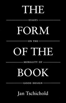
The Form of the Book is actually a collection of essays written from 1949 through 1974 by Jan Tschichold and was originally compiled in 1975. Robert Bringhurst translated it to English from the German text in 1991, and he also wrote an enlightening introduction for that edition. Not everything in the book (or these excerpts) is immediately relevant, but the basic principles can still be applied. I have made sure to leave in some artifacts so you can get a feeling for the text, warts and all.
In case you were confused: I’m not a lawyer, so this may be completely illegal. Nevertheless, I plan on keeping these morsels of knowledge up for as long as I can. I figure that as long as the book is out of print, it’s fair game. So now let me get out of the way; I give you The Form of the Book, digested:
“Introduction” — Robert Bringhurst 1991
“Harmonie and Takt are words that appear repeatedly in some of these essays. The latter is often translated, correctly, as tact. But the German word has musical connotations which its English cognate lacks. Takt means measure, rhythm, time in the musical sense.”
p. xi
“Clay in a Potter’s Hand” — Jan Tschichold 1949
“What some may praise as personal styles are in reality small and empty peculiarities, frequently damaging, that masquerade as innovations. … Personal typography is defective typography. Only beginners and fools will insist on using it.”
p. 4
“We cannot alter the essential shape of a single letter without at the same time destroying the familiar printed face of our language, and thereby rendering it useless.”
pp. 4 – 5
“For perfect typography, an exhaustive knowledge of the historical development of the letters used in printing books is absolutely necessary. More valuable yet is a working knowledge of calligraphy.”
p. 5
“Graphic Arts and Book Design” — Jan Tschichold 1958
“In the strict meaning of the word there cannot be anything ‘new’ in the typography of books. Though largely forgotten today, methods and rules upon which it is impossible to improve have been developed over centuries. To produce perfect books, these rules have to be brought back to life and applied.”
p. 8
“Selecting a font absolutely in tune with the text; designing a consummate page with harmonically perfect margins, ideally legible, with immaculate word and letterspacing; choosing rhythmically correct type sizes for titles and headings; and composing genuinely beautiful and graceful part-title pages in the same key as the text page – by these means, a book designer can contribute much the enjoyment of a valuable work of literature.”
p. 9
“The book designer strives for perfection; yet every perfect thing lives somewhere in the neighborhood of dullness and is frequently mistaken for it by the insensitive.”
p. 10
“On Typography” — Jan Tschichold 1952
“Every type shop should have available at least one representative of old-style roman, complete with italics, in all sizes from 6-point upwards, including 9-point and 14-point, and up to 72-point. In addition, there should be a good Fraktur, also in all sizes, at the very least up to 36-pint. It seems to me that a new-style Roman (Bodoni for example) is a less urgent requirement than one of the styles developed during the transitional period (Baskerville for instance) – but there is no argument against Walbaum roman, which I consider superior to Bodoni, since more restrained. A good slab-serif, as well as a good sanserif, is probably necessary. Yet when a selection is made, one has to keep in mind the fonts already available in order to avoid inherently disharmonious mixtures.”
pp. 16 – 17
“A precondition for satisfactory finished work and for pleasant readability is the correct typesetting of each single line. Most typesetting in most countries is too loose. This defect is inherited from the nineteenth century, whose light, thin and pointed scripts almost demanded word spacing with en quads. Our own somewhat bolder scripts lose their line bond if this wide spacing is adopted. Three-to-em or even more compressed word spacing should be made the rule, unconditionally, and not in books alone. Unless the work consists of unusually long sentences, it is also unnecessary to increase the space after a period.
“The beginnings of paragraphs must be indented. Paragraphs without indent (unfortunately the rule in Germany, and only there) are a bad habit and should be eliminated. The indention – usually one em – is the only sure way to indicate a paragraph. The eye, on reaching the end of a line, is too inert to recognize a tight exit – and in works without indents, even that frequently has to be produced as an afterthought from a flush ‘last’ line. In order of importance, legibility and clarity have to come first; a smooth contour of the typeset page is of lesser importance. Therefore, typesetting without indentions is to be dismissed as an error.”
p. 17
“On the other hand, roman capital letters must always and under all circumstances be letterspaced, using a minimum of one-sixth their body size. This number, however, is no more than a general guide, since the spaces between capitals have to be balanced against each other according to their optical values.”
p. 18
“Today more than ever before, simplicity is the mark of nobility in any piece of masterful work. If you have ever had a chance to observe a real master at work, you may have marvelled at how quick and easy everything looked. He seemed to ‘shake it out of his sleeve’. Laboriously trying first this, then that, is the way of a novice.”
p. 19
“It is doubtful that a graphic artist who cannot also set type can come up with a good and useful typographic design. Planning and execution must go hand in hand.”
p. 19
“Consistent Correlation Between The Book Page & Type Area”
— Jan Tschichold 1962
“Harmony between page size and the type area is achieved when both have the same proportions. If efforts are successful to combine page format and type area into an indissoluble unit, then the margin proportions become functions of page format and overall construction and thus are inseparable from either.”
p. 42
Ideal margin proportions 2 : 3 : 4 : 6.
p. 44
”… the height of the type area equals the width of the page: using a proportion of 2 : 3, a condition for this canon, we get one-ninth of the paper width for the inner margin, two-ninths for the outer or fore-edge margin, one-ninth of the paper height for the top, and two-ninths for the bottom margin. … The key to this positioning of the type area is the division into nine parts of both width and the height of the page.”
p. 45
“Only much later, during the Renaissance, books were produced that were delicate as well as lightweight and handy. Little by little books appeared in smaller formats and proportions which are still conventional today: 5 : 8, 21 : 24 [Golden Section], 1 : √3, and the quarto format, 3 : 4. As beautiful as the ratio of 2 : 3 may be, it cannot serve for any and all books.”
pp. 46 – 47
“Even the division into ninths, while no doubt the most beautiful, is not the only correct one. Dividing in to tweflths we get … a larger type area when compared with figure 5.”
p. 51
“The lines should contain from eight to twelve words; more is a nuisance. The broader margins resulting from division by nine permit a slightly larger type size than does the division by twelve. Lines with more than twelve words require more leading. Typesetting without leading is a torture for the reader.”
p. 57
On Your Marks
There is plenty more knowledge in the book, but I have neither the time nor permission to post it all here. Instead, I ask that if you care about typography, or you recognize the growing need to for this kind of knowledge in the ranks of digital publishers, please do as I have done and contact the good people of Hartley & Marks to let them know that this book needs to be put back in to print. It is ever relevant and necessary, and there is a growing market. This is the best contact info I have for them (from their site), and I will post others means if I get them. Thanks!
Hartley & Marks Publishers Inc.
1008 Western Ave. Ste. 301
Seattle, Washington
USA 98104
tel 1.800.277.5887
pbdesk[at]hartleyandmarks[dot]com
Contact info for Canadian, European, and Asian offices available on their site.