A Manual Kerning Method for the Web
a post on Development
11/12/2013 · On a plane to Geneva · In web typography circles you can’t go celebrating all the shiny new features released over recent years without someone lamenting the lack of kerning. Sure, foundries are doing a fantastic job identifying and correcting for kerning pairs in their fonts, and Open-type features are allowing such intriguing proposed CSS properties as “font-kerning”, but both fall short of the exacting control we type nerds are used to from not-so-distant days driving Adobe interfaces.
I know, great fonts need little-to-no manual kerning, but designers are fickle, silly creatures. Sometimes we want to use a “bad” font, or blow up type designed and paired for small sizes. Sometimes we download dodgy characters because we like their character, and we might then roll them into a custom SVG web font. We’re kooky.
Fix it with JavaScript jQuery?
Paravel has a solution, but Lettering.js – and its subsequent imitators – have a few drawbacks in my experience:
- Preparing every character. I know this is a feature for those styling beautiful, intricate headings – as Trent Walton will do – but feels like overkill for simple manual kerning needs.
- JavaScript dependency. This means there will be a flash of un-kerned type. Not the most terrible offence, but distracting nonetheless. And another JavaScript file means another http request.
- jQuery dependency. Downloading an extra 30kb to fix that “ty” pair is not very performant, and again, another http request.
Lettering.js is great for many reasons, but for manual kerning needs, perhaps we can find something simpler.

A simple, manual kerning method
The kerning methods mentioned thus far are all based on the same assumption: you want to automatically address all of the characters at once. While this seems logical, this does not exactly align with the needs of manual kerning.
With manual kerning we are looking at pairings. There is no need to waste efforts addressing every character, just the occurrence of two characters that have distracting whitespace issues. We seek out these pairs with a trained eye, and adjust the space between until it feels uniform across a word or block of text. This is targeted and nuanced; automation is inappropriate.
After a bit of thought and testing, I have found a method that I believe works much better for manual kerning. Let’s start with this block of text:

And the HTML:
<h1>The smart brown fox jumps over the lazy dog.</h1>
Looks pretty good as is, right? But spend some time staring at this, and you might notice that “ju” pair has a little too much air. And the “zy” feels a little tight. We’ll address the latter, first:
- In your HTML, wrap the first letter of the offending pair in a span. (Wrapping both affects the space between and the space after the pair.)
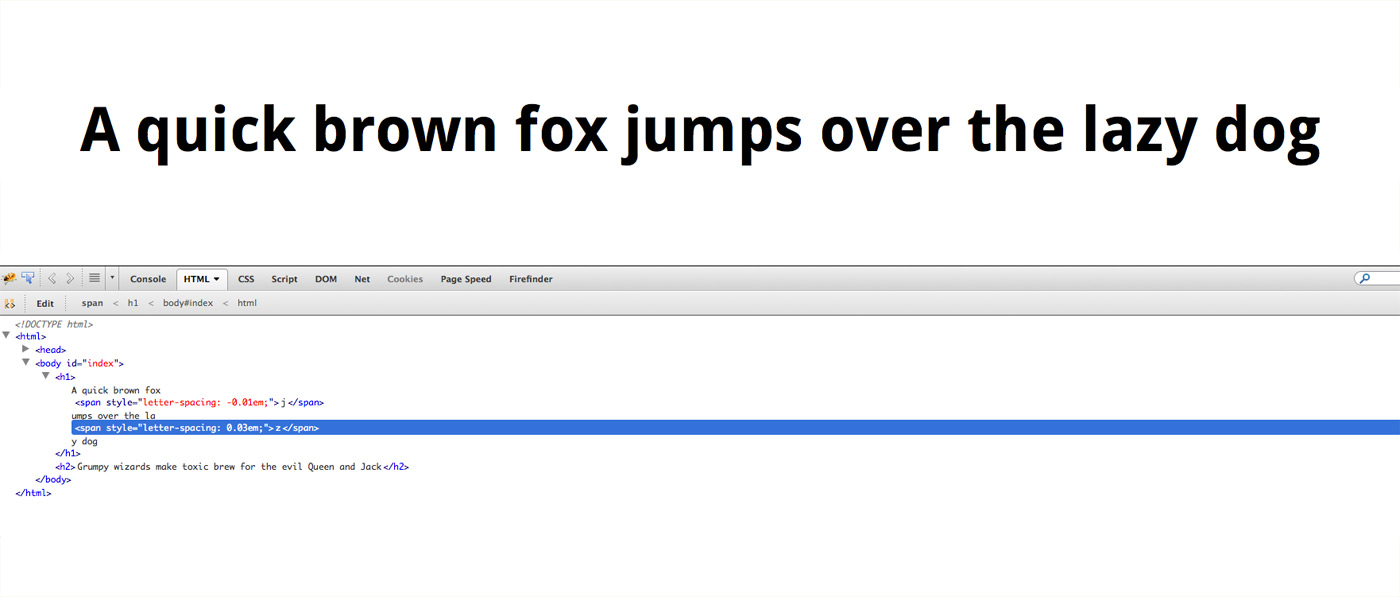
<h1>The smart brown fox <span>j</span>umps over the lazy dog.</h1> - Add letter-spacing, right there, in-line to pull or push the space between the pair. In this case we need negative letter-spacing. Feel free to use whatever unit you like:
<h1>The smart brown fox <span style="letter-spacing: -0.05em">j</span>umps over the lazy dog.</h1> - Take a look in your browser, inspect the span element, and adjust the space until it feels uniform with the rest of the word.

For particularly nasty fonts, you may want to wrap all of the offending pairs first, then work out all of the values in inspector. Using a find and replace method will help with consistency. I find this workflow most comfortable and pretty speedy.
Now, that second step may be a bit controversial, and I understand that, but here I prefer inline styles over classes. Creating a class and editing the letter-space a CSS file seems too far removed from the problem. I like to keep those values right where they make the most sense, for now.
This simple manual kerning method removes the need for any extra scripts, targets only the spaces that need fixing, and is fairly simple to implement. It gives me exactly the kind of control I want, and best yet: I can’t think of a browser still kicking today that would choke on a span with letter-spacing.

Going a bit further
In exploring this concept of manually focusing on problem pairs, rather than implementing systematic adjustments across all characters, I had a notion about how this process might look as a CSS property. Imagine having this kind of control:
h1 {
  font-size: 2em;
  kerning-pairs: zy -1px,
                 ju 0.05em;
}
Hot damn, wouldn’t that be nice? No need for spans or any unnecessary markup, and it sits right there next to your other styles. You simply identify the character pairs you want to adjust, and then set the amount and unit of adjustment. Repeat as needed, and get as nuanced as you like.
After tweeting about this, I learned that Bram Stein, over at Typekit, had already made a similar proposal. I would be overjoyed if either of these syntax ever saw their way in to the spec. So we make proposals, and maybe in 5 years we’ll see.
Or try it right now
If you are the impatient type and want to give this syntax a try, right now, I have created a stylefill that will allow you to use the kerning-pairs property right now. A ‘Stylefill’ is my term for a piece of JavaScript that manipulates elements to mimic the results of a proposed CSS property, much like a polyfill but focussed on CSS properties. This gives us the opportunity to stress test these syntax before even thinking about codifying them in the spec.
Go grab the kerning-pairs script from GitHub, put the syntax to the test, and please feel free to contribute.
