On Widows, and How to Fix Them
a post on Typography
15/06/2012 · On a train from Brighton, UK · Dangling from the last line of a paragraph, a typographic widow is a thought fragment severed from its context. They are the result of careless typography – and should be policed – but given the current fluid nature of our web, widows appear with impunity throughout our pages. They are a blind spot, because to notice would invite outrage on the current futility of fighting such details in our ever-responsive layouts.
What’s the Big Deal?
A widow can be defined as a leftover word, but it can be more specifically defined as an ending line of a paragraph measuring less than a certain amount of characters. I learned once that this certain limit should be 14 characters, but I’ve since come to the opinion that this largely depends typographic choices such as a chosen typeface’s em-width or the overall measure of preceding lines. 14 characters is a great rule of thumb, but you should exercise your own taste as to what feels disconnected.

However you identify it, a widow, much like a line break, has an unintended, semi-conscious effect on a reader. The isolation of these characters lends them an irrelevant emphasis. They are removed from their place in a full sentence and left exposed to individual scrutiny, if ever so brief.
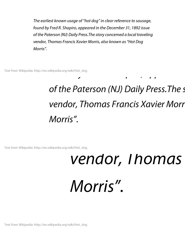
Our ideal reading experience will flow free from interruptions that lead us to contemplate the etymology of the term “hot dog”. By giving those widows some inline company, we can allow them to once again complete their intended notion.
Easy for you to write
I know, I know. Fluid, responsive pages mean that we give up control; trust in the code and not concern ourselves with these phantom worries of typographers’ past. But shrugging widows away does not make them any less disruptive. As Phil Baines aptly explained in his talk at today’s Ampersand Conference – speaking on web typography’s renaissance of historic design principles [I am paraphrasing here]: “Nothing has changed. Humans still read the same way.”
Solutions exist, but they merely mask the symptom and fall far short of solving the problem. By breaking one word sooner, as one does, you may still wind up with what constitutes a widow (by our character-count definition) and you can also wind up with strange holes in your text’s flow.
The solution we need must work as a typographer would work. It must solve the problem as we would solve it were we given that kind of control.
Three typographic methods for taming a widow
- Increase the space between words until a sufficient number of characters have been pushed to the last line. This usually is the least noticeable fix, but too much word spacing will lead to unsightly gaps and rivers which can be much more disruptive to the reading experience.
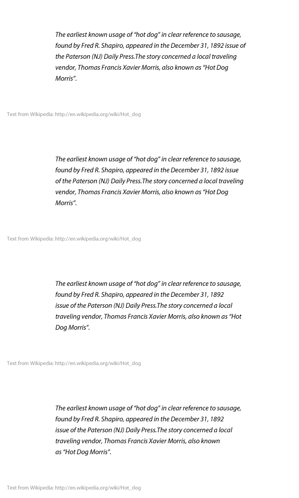
- Police the right rag (or adjust the breaking point at the right of each line) until your paragraph achieves the desired shape. This solution is again less noticeable within the paragraph, but can cause the overall shape of a paragraph to be obviously shorter or longer than its siblings. Like so:

Policing the right rag. - Track out your type (or increase the space between letters, rather than words) until the widow is buried. This is the most appalling of solutions, especially with lowercase letterforms, but in some rare cases may work best.
Whichever method you choose, you should employ small, incremental changes until the widow is gone, trying your best to not mar the uniformity of your content.
Or, meet type.js
Type.js is a pure Javascript library (no need for jQuery), in which I have attempted to build typographic solutions that work like a typographer would. The widow-adjust feature allows you to define how you want widows to be fixed in your content: assigned to specific HTML elements and using the methods outlined above.
You can set the amount of characters you consider to be a “widow”. You can choose the method you wish to employ (respective to the list above: word-spacing, padding-right/left, or letter-spacing), and you can set it to run based on browser resize, orientation change (on mobile), or any other window event. I personally feel orientation change is sufficient for most reading experiences, but if you want to show off a responsive design, setting the Tamer to fix on browser resize will work well. If you want to see an example page, well, you’re reading one. I currently use The Widow Tamer on this site.
Please read more about how it works, and give it a try… but be sure to tell me how it goes.
