Abused Typefaces
a post on Typography
“Typography is an art that can be deliberately misused.”
— Robert Bringhurst
09/01/2009 · Dallas, TX · Some typefaces aren’t bad: they’re just poorly applied. Some are so useful, they become ubiquitous, and others are just completely devoid of purpose. I like to think of typefaces more as tools of communication, with specifically designed purposes, rather than objects of art. By regarding typography as a tool, you can focus more on the intended function of a particular typeface, allowing for a more appropriate application, and generally, a more successful communication. Here are some of the most ubiquitous typefaces used in design these days, and how each is used, abused, or can be properly avoided.
Times New Roman: The Underdog
Times New Roman could easily be considered the most successful typeface of all time. Within a few years of being commissioned from Stanley Morison (with Victor Lardent) for The Times newspaper in 1931, TNR was the most widely used typeface in the newspaper industry, seeding its massive popularity 60 years before it was ever packaged with Microsoft products. One of the safest bets in the world of design these days, though, is that in any “properly” considered piece (except newspapers), the type setting will not be in Times New Roman. The mindset persists, with designers, that if TNR is a default typeface (as it is in the majority of software), any designer worthy of firing up an Adobe product should be able to explore options beyond the default. Is popularity, though, really a sound reason to banish a typeface from our type libraries?
TNR has enjoyed such a wide application for a reason. It not only revolutionized the newspaper industry at its birth, but it has survived on the merits of its design to out-live its original medium, and extend its typographic legacy long in to our digital times. Default or not, Times New Roman continues to be used in fresh and interesting new ways, and serves as a consistently solid serif choice in both print and web-design.
Suggested Usage:
For further examples of Times New Roman’s continued relevance, check out this article by David Shea, and take a look at how Coudal Partners have successfully utilized TNR for their site.
Helvetica: Mr. Popularity
If we’re still betting on typography, the second safest bet in design today is that in any given design piece, Helvetica has been used somehow. Helvetica has been, and continues to be an immensely popular typeface. Heck, like any good celebrity, it’s even had a movie made of its life. First drawn in 1956 by Max Miedinger, and based on Akzidenz Grotesque, Helvetica’s forms “evoke uncultivated strength, force and persistence”, as Robert Bringhurst has described it in The Elements of Typographic Style. Given these attributes, it is no wonder why designers have applied Helvetica to everything from subway signage, to toothpaste ads, to web pages.
But are all of these applications appropriate? Mr. Bringhurst goes on to say that even the lighter weights of Helvetica, issued in more recent years, “have done much to reduce its coarseness, but little to increase its readability.” The fact is, Helvetica, and its recent incarnation Helvetica Neue, are primarily successful as display typefaces, used best in headers and signage, not body copy. Therefore, Helvetica, as a tool for any typographer, is seriously limited.
Suggested Usage:
Helvetica’s not-too-distant cousin, Arial, is actually much more adept in the areas that Helvetica is weak, since Arial was designed for better readability at small sizes and on the screen. Like Times New Roman, Arial is also an unfortunately overlooked typeface, and many designers ridicule its homeliness, while negating its usefulness as a body copy workhorse. But by combining Helvetica and Arial, and utilizing each for their specific strengths, both can work in tandem to achieve a typographical success.
Copperplate: The New Black
Banks, steakhouses, law firms, and auto-repair shops… Copperplate has been used for all sorts of purposes, and has fastly become the de facto typeface for any piece that requires an air of establishment. Designed by the enormously successful typographer Frederic Goudy in 1901, Copperplate Gothic was intended to be set at small sizes on letterhead and business cards. Today, Copperplate has become the typeface of the modern suburb, assuring consumers that businesses of every sort are worthy of their money.
Copperplate’s sharp serifs work well to aid its readability at smaller sizes, but also seem to be misunderstood as giving the characters an old-world, stable ambience. The main distinctive feature of Copperplate is exactly why it has become so attractive to designers, and is exactly why it fails as a display typeface. The pointy serifs, at larger sizes, create distracting hot points at the ends of the letter-forms, severing the relationships between each letter, and forcing each character to be read individually. This destroys readability, and when Copperplate is overused, the effect can become quite nauseating.
Suggested Usage:
Keep it small.
Serpentine: Why?
I see the growing popularity of Serpentine as heralding the eventual descent of the Western world in to utterly encompassing idiocy. In fact, I cannot view any piece utilizing Serpentine without thinking of Mike Judge’s Idiocracy. Unleashed in 1972 by Dick Jensen for the Visual Graphics Corporation, Serpentine has a few weights, but only one speed: maximum warp. But even with its overly emphasized, horribly distorted letter-forms, Serpentine has its place. And for the love of all that we hold sacred as designers: keep it there.
What kind of a prison should we keep this beast in? One contained within the four walls of NASCAR, Professional Wrestling, strip clubs, and all-night discos. Anything including and related to these establishments have full reign to use Serpentine. Everything else must please find some other way of trying to convey speed, power, aggression, or machismo, unless you wish to do so in the cheapest fashion possible.
Suggested Usage:
Other type families to consider, besides this plague: Akzidenz Grotesque, Univers, Eurostile, or anything else bold and italic.
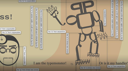
Special thanks to Richard Molinaro for the piece featured on this page. Check out the full piece, or to view other examples of Richard’s typographic works, visit him here.