Islands of Thought in Macrotypography
a post on Typography
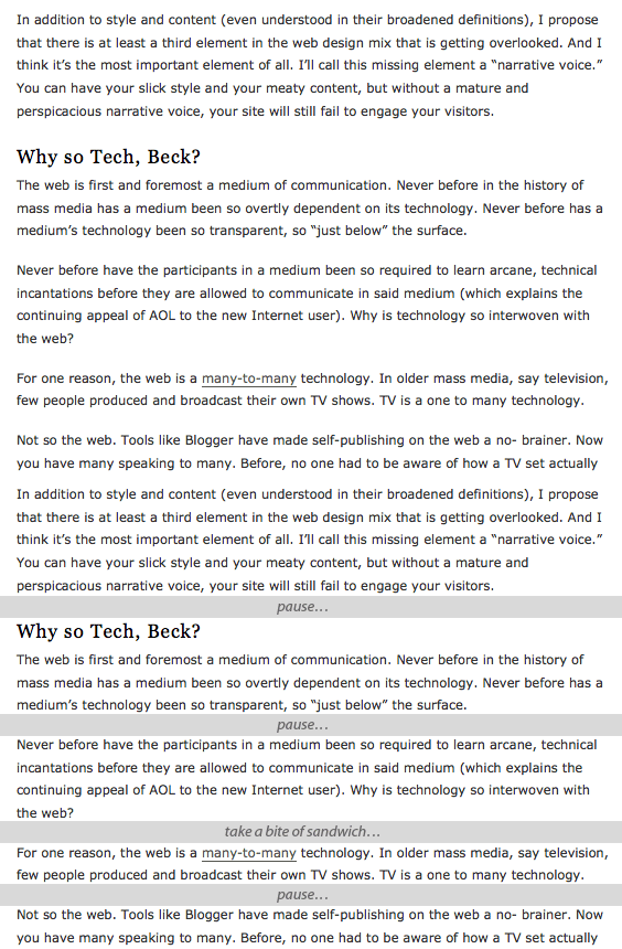
04/01/2012 · Penarth, Wales · Proximity is one of the most ruthlessly subconscious of Design tools. Closeness relates, and every expanse of negative space severs. The deliberate and exact manipulation of space is a mark of superior Design (especially at macrotypographic levels), so let’s quit with the line breaks between paragraphs on the web, shall we?
Almost every time I settle into an online article, I am reminded that the web was first born for physicists. Between every well-thought-out paragraph is found a fat wedge of nothing-at-all. Why? Well to indicate a new thought of course …with all the subtlety of a Large Hadron Collider. These spaces effectively chop the text into what I call “islands of thought” – disconnected paragraphs floating downstream, with only their left-right boundaries holding them together.

However subconscious, these spaces cause a disruption in flow that is completely unnecessary. There is a better way.
The Frugal, Modest Indent
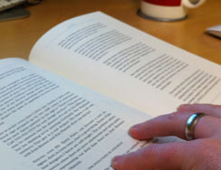
If you can find one, pick up a book and notice its paragraphs. More than likely, the first line of each is indented about 2–4 spaces. The very thorough Jon Tan has written a great article in which he details how this paragraph style evolved in printing. In it, Tan tells us that full line-breaks between paragraphs would require more paper, resulting in increased production costs. It was much more frugal to just use a slight indent. I would argue, though, that there are aesthetic justifications for the indent as well.

A full break is a lot of space to give over to such a minor and repetitive indication. Indents, conversely, are subtle: an indent of 2-4 ems accomplishes the same goal as a full line break. Adjacent paragraphs are allowed share a border, flowing thoughts from one to the next. A full break should only be used when the flow is deliberately broken, either to move on to another thought within a section or just for emphasis.
For example.
When there is very little thematic flow from one paragraph to the next, though, line breaks may still be appropriate. Breaking news stories or brochure-ware pages with disparate copy are both perfect examples where full line breaks may make more sense, while indented paragraphs are most appropriate in long-form text. Basically: Design should be efficient, deliberate and communicative with every use of space.
Bring it all together
More eloquent men than I have fought this battle on the web. Joe Clark, in an article for A List Apart, perhaps says it best:
“Blank lines between paragraphs are a Microsoft Word artifact that are additionally widely used in onscreen text. In book typesetting, they’re a mistake…”
He also provides a very simple way to achieve indents with CSS:
p + p { text-indent: amount of indent; }
We use p + p here because an indent should only be applied to a paragraph that follows another paragraph. A paragraph that follows a heading, image, or any other element should be visually different enough not to need an indent. Also, use your best judgement as to the amount of indent. I’ve found 2em will usually suffice.
At first, indents on the web tend to look a bit strange, given that they are so rarely seen. In order to retrain your eyes for the transition, feel free to use this (very rough) bookmarklet to reflow any text on any site:
Drag it into your bookmarks bar and click it when reading any article, but be warned:
You will never look at text the same way again.
